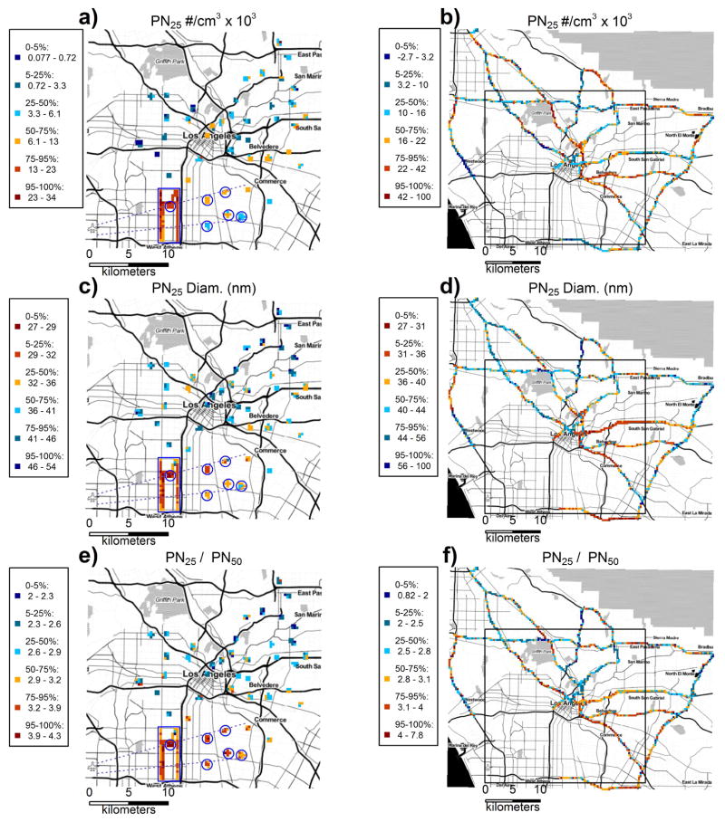
Figure 1.
Map of Los Angeles mobile monitoring data for three pollutant metrics. Data spatially binned into a grid with 300 m × 300 m cell size, and the median was calculated for each bin. Color scale represents quantiles of the resultant spatial bins. Original PN25 concentrations have been adjusted by aligning data collected on separate days using the daily 5th percentile. PN25 concentrations presented are the incremental concentration change from the 5th percentile; there are no negative measurements in the original data. Particle size and PN25/PN50 are calculated with the original (unaligned) data. Figures a, c, and e: The solid blue box encloses the airport transects, solid blue circles indicate airport FPs. Dashed blue lines leading to LAX airport indicate approximate approach paths to the two landing strips (see supplemental Figure S2). Figures b, d, and f: The black box indicates the zoomed-in spatial region displayed in Figures a, c, and e.

