
Figure 2.
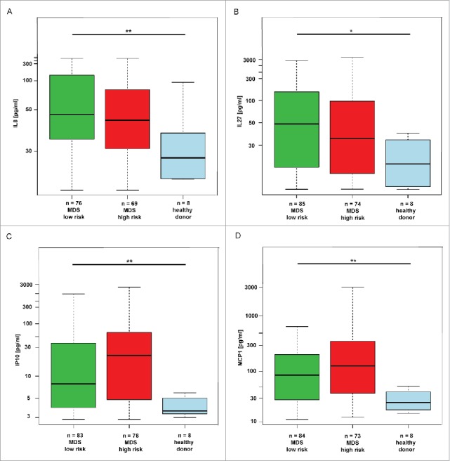
Changes in cytokines in low-risk MDS, high-risk MDS and AML compared to healthy donors. The box plot graphs demonstrate the upper and lower quartiles, and the median is represented by a short black line within the box for each group. The p value signifies the difference for the given cytokine measurements between all three groups. The data set was analyzed by robust linear mixed effects model at the 95% confidence interval. p values < 0.05 were considered as statistically significant. Each significantly upregulated cytokine is depicted in a separate graph, i.e., for (A) IL8 (p = 0.01), for (B) IL27 (p = 0.04), for (C) IP10 (p = 0.01) and for (D) MCP1 (p < 0.01).