
Figure 5.
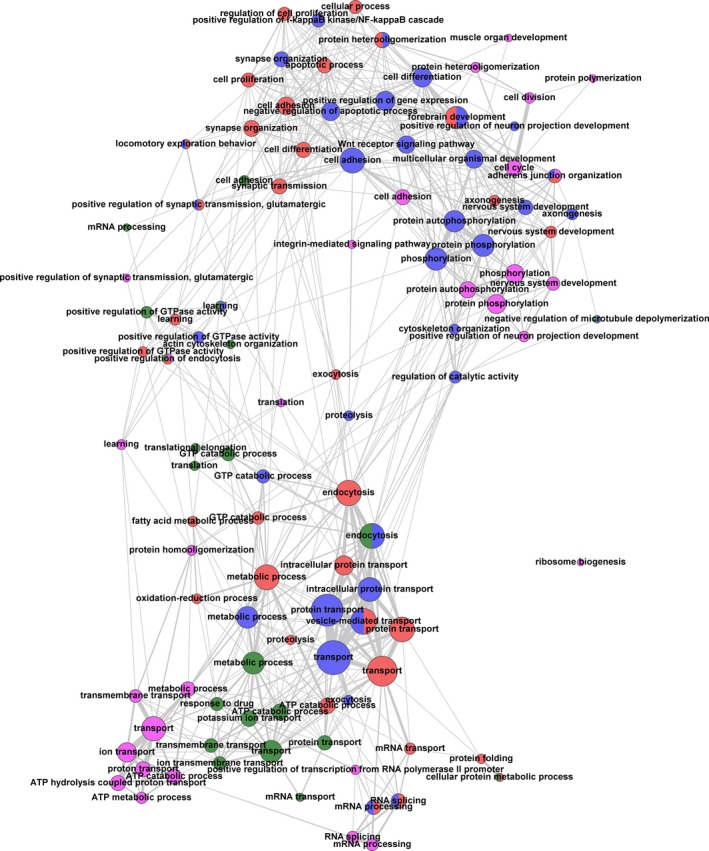
Representation of biological functions and pathways in the identified protein data sets by single enrichment analysis (SEA) utilizing GeneCodis as a tool (see Table S6). The analysis was performed for each examined brain region with the combined data on protein and phosphopeptide abundances (Tables S3 and S4). Annotation databases such as Gene Ontology (GO) (http://geneontology.org/) assign proteins and genes to their ‘biological functions’ or ‘biological pathways’. The SEA tests for significantly represented biological pathways within a given list of proteins. The significance is determined by comparing the frequency of representation of a given pathway in that list with the expected random frequency. The network was calculated by in‐house scripts and visualized with the tool Gephi (http://gephi.github.io/). Only GO terms with at least three proteins in at least one of the brain regions were taken into account. Nodes are depicted as circles. Each node represents a GO term, the color indicates the brain region (green: auditory cortex; blue: frontal cortex; magenta: hippocampus; red: striatum). The size of a given node visualizes the number of proteins that it has in common with other nodes. Additionally, the number and strengths of connections (indicated by line width) indicate the number of proteins that a particular node shares with other nodes. Numbers and strengths of connections, in turn, determine the distance of nodes, thus clustering closely related nodes. If nodes represent the same GO term and include identical sets of proteins, but derive from different brain regions, they were merged into one node (indicated by respective colors).