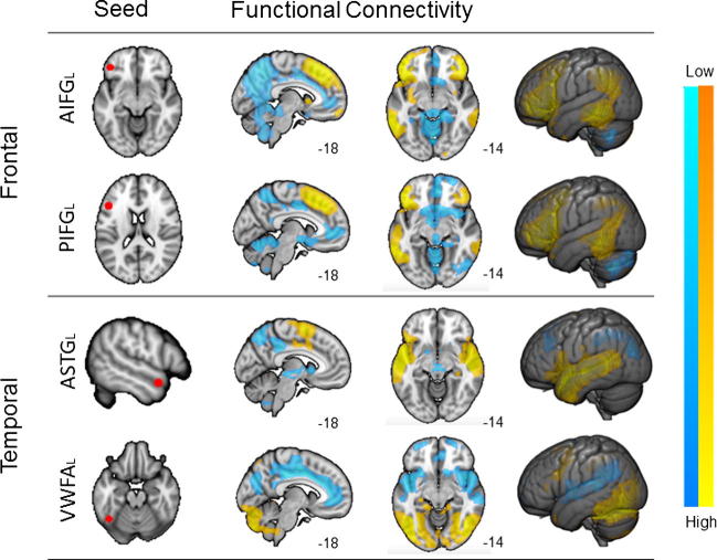
Fig. 1.
Seed based connectivity maps. This figure shows the results of a seed-based connectivity analysis from each of the seed regions. The location of the seeds is shown in the left most image in each row. Spatial maps were thresholded at Z < 2.3 and corrected at p < 0.05 FWE. The different colour schemes describe the strength of correlations with the seed regions.

