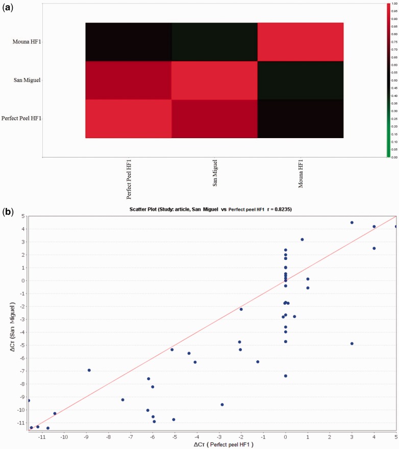
Figure 6.
(A) Signal correlation of San Miguel F1, Perfect peel HF1 and Mouna HF1 genotypes. The colour scale represents relative expression levels with red as increased transcript abundance and green as decreased transcript abundance. (B), (C) and (D) represent the scatter plot for global expression between San Miguel, Perfect Peel HF1and Mouna HF1, repectively. The Pearson correlation coefficient “r” is shown.

