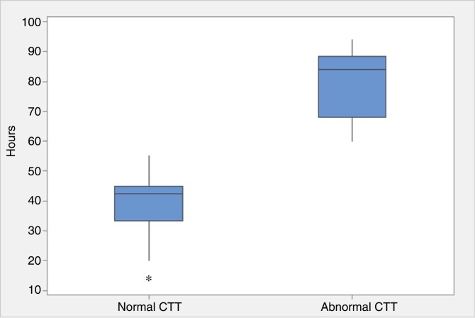
Figure 6.
Box plot graphs highlighting the CTT (hours) defined by WMC. The 53 patients studied were separated into normal (CTT<59 hours) and abnormal (CTT>59 hours) groups. The plots display the distribution of data as: minimum (bottom whisker), first quartile (lower part of box), median (line in box), third quartile (upper part of box), and maximum (top whisker). CTT, colonic transit time; WMC, wireless motility capsule.

