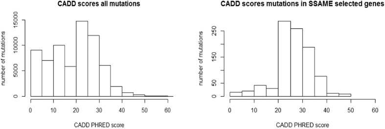
Figure 5. Analysis of selected genes.
CADD score distribution of all mutations (left histogram), and of the set containing the mutations in the genes prioritized by SSA-ME (right histogram). The X-axis depicts the CADD score and the Y-axis depicts the frequency of mutations having a CADD score within a certain range.

