Figure 1.

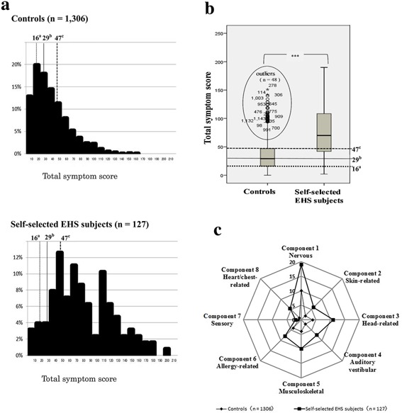
Comparison of total symptom scores between controls and self‐selected EHS subjects. 1a. Histogram showing total symptom scores. EHS: electromagnetic hypersensitivity. 1b. Box‐and‐whisker plots showing total symptom scores. Plots inside ellipse represent outliers that are not within normal range. Note: differences in median scores of total symptoms between self‐selected EHS subjects (n = 127) and controls (n = 127) were compared using a Mann–Whitney U‐test with Bonferroni correction for multiple tests (100 tests; P < 0.0005); ***P ≤ 0.00001. For 1a and 1b: The a25th percentile (16 points), b50th percentile (29 points), and c75th percentile value of controls (47 points). 1c. Radar chart showing median values of symptoms for eight principal components (factors 1–8). Differences in median values of symptoms for all eight principal components between self‐selected EHS subjects (n = 127) and controls (n = 127) were analyzed using a Mann–Whitney U‐test as above. There were significant differences (P ≤ 0.00001) in median values of symptoms for all eight principal components.
