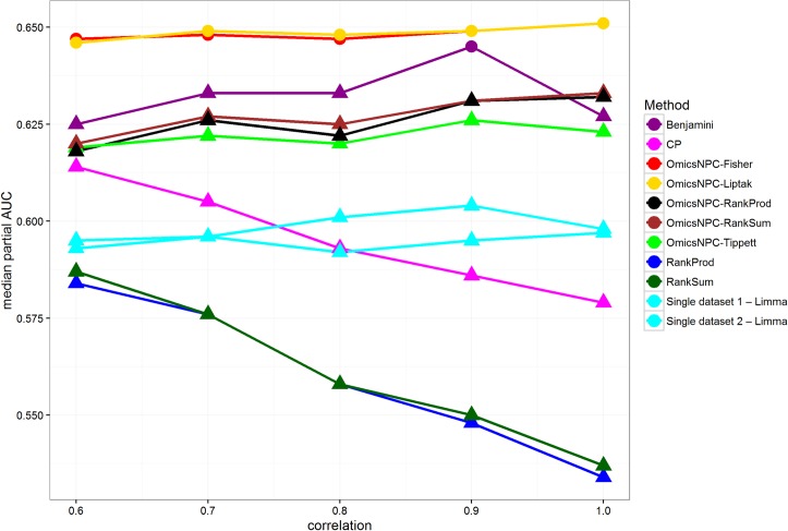
Fig 5. Median pAUCs in relation to correlation structures.
Each line corresponds to a specific method. The x axis represents the level of correlation introduced between the datasets, and the y axis the median pAUCs. Circles suggest that the observed differences from the best method were not statistically significant at level 0.05. omicsNPCFisher and OmicsNPCLiptak were the best methods in all cases. All functions employing omicsNPC framework, as well as Benjamini, showed a stable performance regardless the correlation intensity. On the other hand methods which did not account for the correlations structures, showed decrease in performance as the correlation was higher. Note that single-dataset analyses, sky blue lines, performed better than these methods when strong correlations are present.

