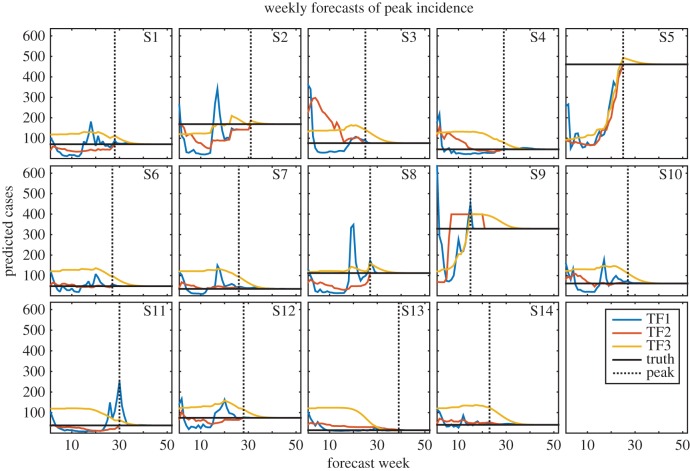
Figure 2.
Weekly TF1 (blue), TF2 (red) and TF3 (yellow) forecasts of peak incidence for years 1 through 14. The horizontal black line indicates the true peak incidence. The dotted black line shows the timing of the observed peak; forecasts to the left of this line were made prior to the peak and forecasts to the right were made after the true peak had passed.

