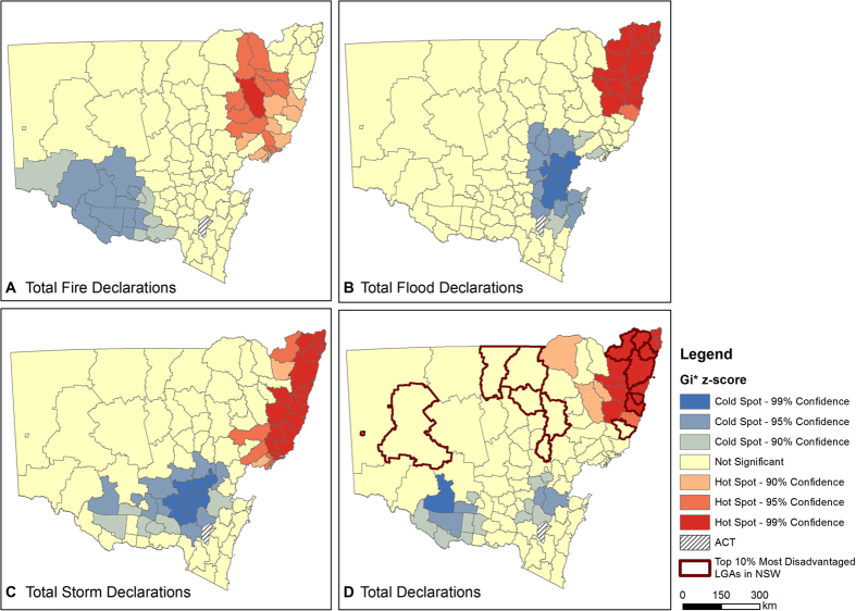
Figure 3. Spatial clusters of high and low disaster declaration between 2004 and 2014.
High Getis-Ord  z-scores indicate more intense clustering of high declarations (hotspots), shown in red, and low z-scores show more intense clustering of low declarations (cold spots), shown in blue. (A) Total Bushfire Disaster Declarations; (B) Total Flood Disaster Declarations; (C) Total Storm Disaster Declarations; (D) Total Disaster Declarations (all types combined). The 10% most socio-economically disadvantaged LGAs in NSW are shown with dark boundaries. Figure created using Esri ArcGIS 10.2 (https://esriaustralia.com.au/products-arcgis-software-102).

