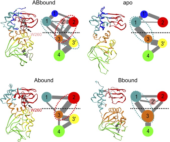
Fig. 3.
Community analysis of the four systems. For each system, the average cMD structure is shown in the left panel, with communities shown in different colors: 1, cyan; 1′, blue; 2, red; 2′, pink; 3, orange; 3′, yellow; and 4, green. In the right panel, communities are represented as colored circles, connected by lines with widths proportional to the cumulative intercommunity betweennesses. Communities with less than 10 residues are not included; neither are betweennesses that are smaller than 10% of the maximum. The horizontal dash separates the two domains. Ovals in cyan or red dash highlight the dominant pathways for interdomain communication.

