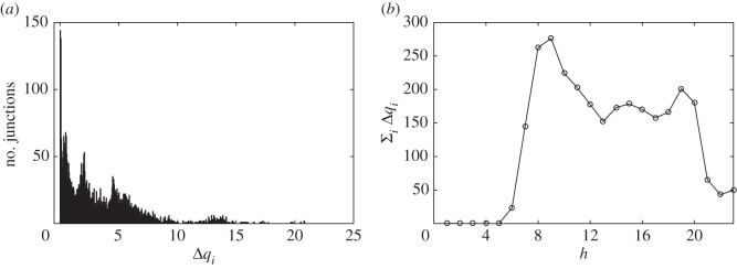
Figure 4.
Statistics of Milan congestion hotspots. Panel (a) shows the distribution of the vehicle increments (Δqi) of each congestion hotspot predicted by the MCM. The plot aggregates the MCM predicted congestion considering the average traffic for every weekday and every hour of the day. Panel (b) shows the average city congestion in terms of mean increment of vehicle in transit for every hour of the day during a weekday.

