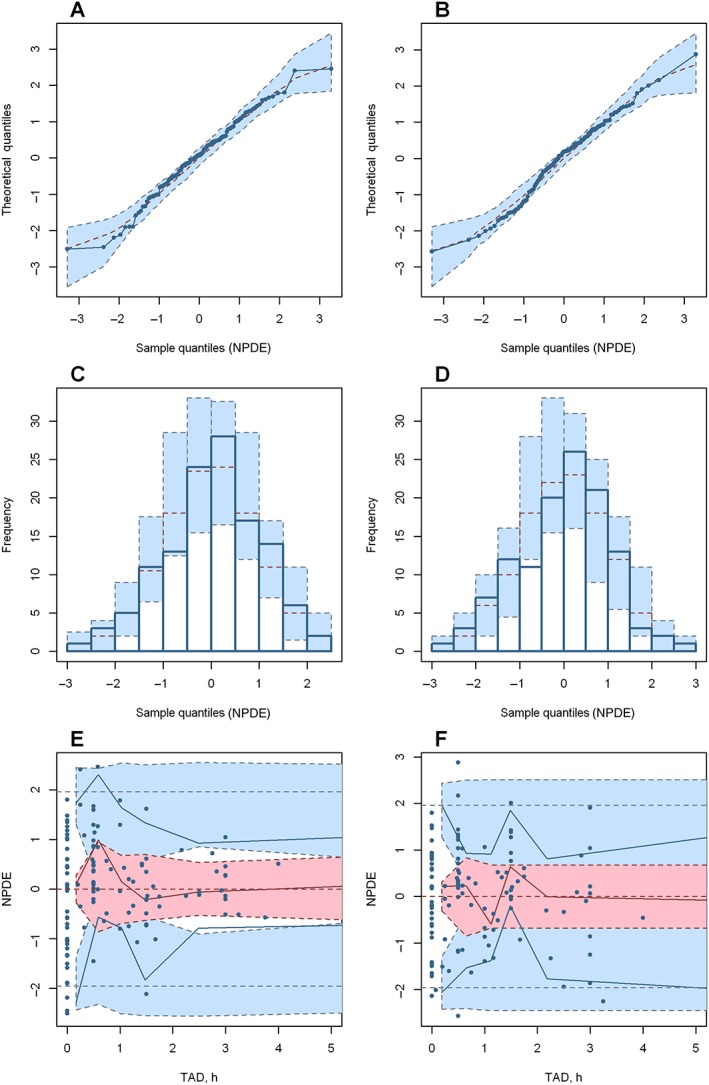
Figure 3.

Normalized prediction distribution error (NPDE) plots of the final model for doxorubicin (A, C, E) and doxorubicinol (B, D, F). (A) and (B) are quantile–quantile plots of the distribution of NPDE against theoretical distribution (blue‐shaded area). (C) and (D) are histograms of the distribution of NPDE against theoretical distribution (blue‐shaded area). (E) and (F) are plots of NPDE vs. time after dose (TAD). In plots (E) and (F), the red solid line represents the median NPDE of the observations; the red‐shaded area represents the simulation‐based 95% confidence interval (CI) for the median; the blue solid line represents the NPDE of the observed 5th and 95th percentiles; the blue‐shaded area represent simulation‐based 95% CI for the corresponding model‐predicted percentiles; the blue circles represent NPDE of the observations
