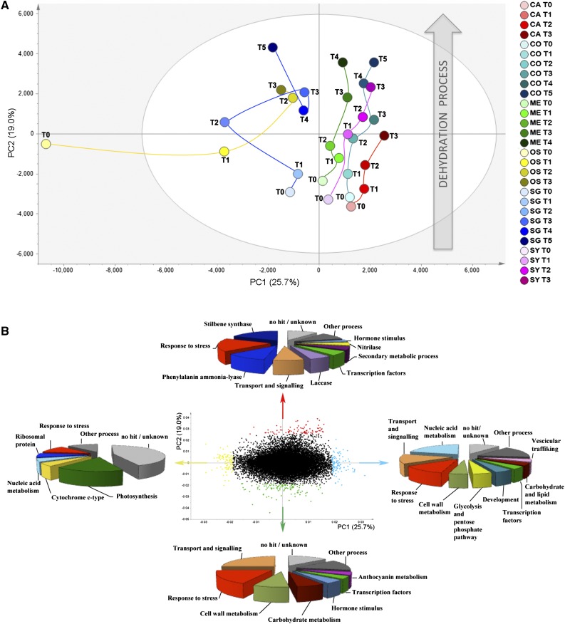
Figure 5.
The dynamic berry transcriptome during postharvest dehydration. A, PCA score scatter plot of the model obtained for transcripts detected by microarray analysis during postharvest dehydration in each variety (explained variance = 44.7%). Samples, corresponding to the averaged value of the three biological replicates at each stage, are colored according to variety. CO, Corvina; SA, Sangiovese; ME, Merlot; SY, Syrah; OS, Oseleta; CA, Cabernet Sauvignon. B, PCA correlation loading plot of the PCA model. Groups of genes more correlated to the first and second components are shown in different colors: first principal component negatively correlated, yellow; first principal component positively correlated, light blue; second principal component negatively correlated, green; second principal component positively correlated, red. The most represented functional categories for each group of genes are indicated by the arrows.

