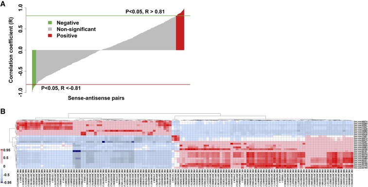
Figure 4.
Representation of correlation analysis. (A) Correlation analysis between cis-NATs and their sense genes. The red and green bar plots represent the positively and negatively correlated cis-NATs and sense genes pairs, respectively. (B) Heat map of correlation analysis between DE lncRNAs and annotated genes. The red and blue fill colors of the heat map cells represent the positive and negative correlations, respectively. The color bar is shown on the left.

