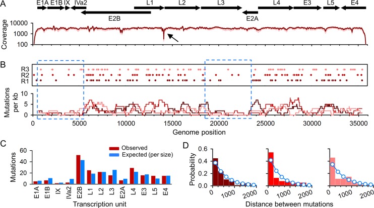
Fig 2. Distribution of spontaneous mutations along the HAdv5 genome.
A. Genetic map and sequencing coverage. The protein-coding regions of different transcription units are indicated on top with arrows showing their orientation. The dark red line indicates the median coverage from three biological replicates, and the light red line indicates the lowest and highest coverage values. A sharp coverage drop was found around genome position 14,073 (arrow). B. Mutations observed along the viral genome for each of three independent biological replicates (R1, R2, R3). Each circle represents a nucleotide substitution. Insertions/deletions are not plotted. The substitution count averaged over a 1 kpb sliding window (dark red: R1; bright red: R2, light red: R3) is shown below. The dotted blue squares indicate two regions of low mutation accumulation. C. Observed mutation counts per transcription unit (coding regions) versus expected counts assuming a constant genome-wide mutation rate. D. Distribution of the distance between consecutive mutations (color codes are as in B). Histograms show the observed distances, and the superimposed blue dots/lines correspond to a geometric distribution (null model).

