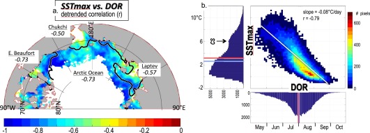
Figure 6.

(a) Detrended correlation of the SSTmax and the DOR (95% significant trends only) over the years 1982–2014. Regional mean correlations are also shown, as well as the mean DOR = 1 August black contour (Figure 4). (b) Scatter plot of detrended SSTmax versus detrended DOR, with the overall linear best fit shown as a thin white line. Also shown are the histograms for each axis with pixel counts. The early, warm peak in Chukchi Sea (CS) SSTmax is noted. The mean (red line) and median (blue line) for each axes' histogram are also shown.
