Figure 8.

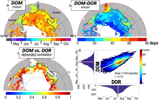
The 1982–2014 mean (a) DOM and (b) DOM‐DOR. (c) Detrended correlation of the DOM and the DOR (95% significant trends only) over the years 1982–2014. The mean DOR = 1 August black contour is also shown in Figures 8a–8c. (d) Scatter plot of detrended DOM versus detrended DOR, with the overall linear best fit shown as a thin white line, similar to the scatter plot in Figure 6b.
