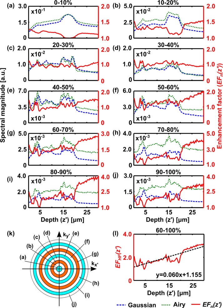
Fig. 3.
Explanation of Fourier analysis method. (a–j) Plots of normalised spectral magnitude, Sn (z′), versus tissue depth for datasets shown in Fig. 2, acquired with Gaussian (dashed blue) and Airy (dotted green) light-sheet illumination within selected spectral windows, (a) 0 – 10% 2NA/λ – (j) 90 – 100% 2NA/λ. The enhancement factor, EFn (z′), (red; second axis) is also plotted. (k) Illustration of spectral windows used to segment the data for plots (a–j). The dashed circle corresponds to a spatial frequency of 2NA/λ. The annular regions each cover 10% of this frequency range. (l) shows the average enhancement factor over high-frequency spectral bands, EFHF (z′), (60 – 100% 2NA/λ). Dashed line in (l) shows a linear fit to the data, equation shown on plot.

