Fig. 6.
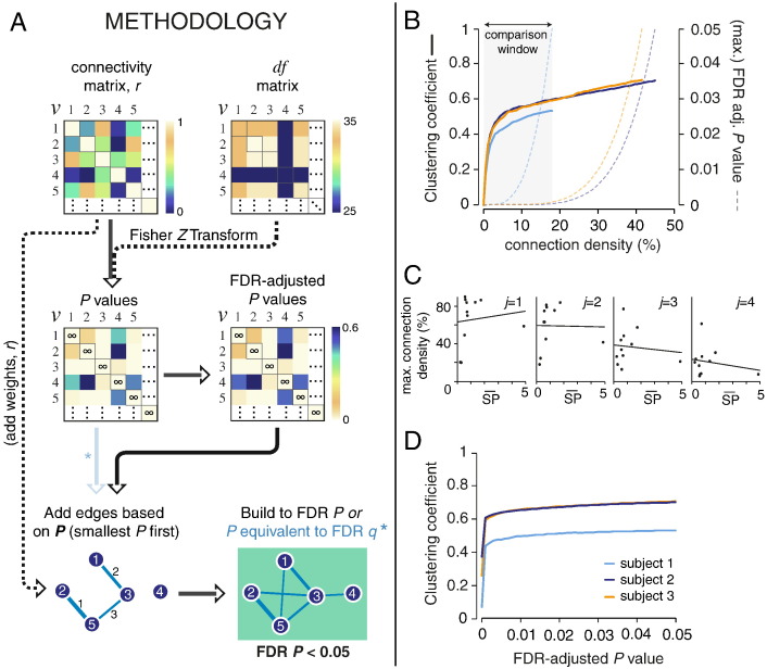
Proposed methodology for building graphs, and thresholding connection density, based on the statistical properties of edges.
(A) Toy example demonstrating the proposed methodology. Connectivity matrices (r) are transformed to Z scores, accounting for edge df (here shown in matrix form), and subsequently to P values by comparison with the standard Normal distribution. These P values can then be adjusted for multiple comparisons. Edges can then be added to the growing network based on their P value, smallest P first, and built up to a given P value threshold. Here we use a FDR-adjusted P value threshold of 0.05.
(B) Demonstration of the approach shown in A for the clustering coefficient. The clustering coefficient was calculated after incremental addition of edges by P value, and plotted against the connection density. This was demonstrated for 3 subjects in cohort 2 with differing levels of artifact – high (orange), medium (dark blue) and low (light blue) – as estimated by the mean spike percentage (see Section 2.6 of the Methods). Graphs were built up to a FDR-adjusted P value of 0.05. The maximum P value across all edges in the network for each connection density is shown by the correspondingly colored dotted line. Cross-subject comparison can be conducted within the “comparison window” indicated.
(C) The mean spike percentage plotted against the maximum connection density possible if the network is thresholded at FDR-adjusted P < 0.05, at wavelet scales 1–4 (j = 1, 0.13 < f < 0.25 Hz; j = 2, 0.06 < f < 0.13 Hz; j = 3, 0.03 < f < 0.06 Hz; j = 4, 0.02 < f < 0.03 Hz). (D) The clustering coefficient values in panel (B) re-plotted as a function of P value, demonstrating an alternate approach for cross-subject comparison of network measures.

