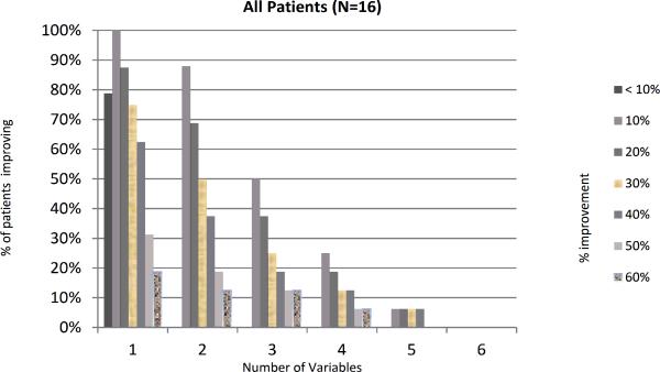
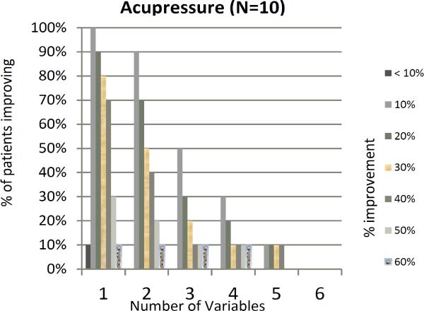
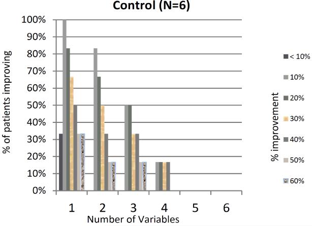
Figure 3.
Percentage of patients showing X% improvement in X number of variables. The graphs show the percentage of patients showing improvement on the x-axis, and the number of variables that have an improvement on the y-axis. (P value comparing acupressure groups vs. control >0.10). a- all patients, b- acupressure group, c control group.


