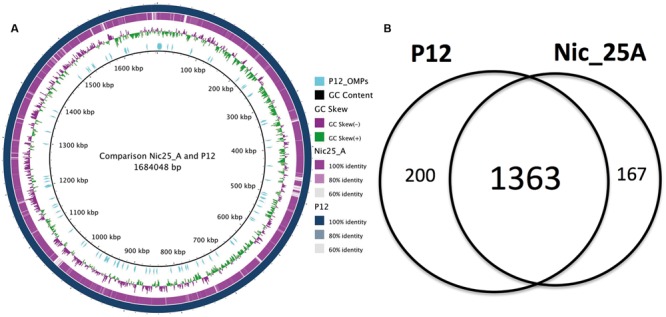
FIGURE 2.

Comparative genome analysis between Nic_25A and P12. (A) Comparison between the Nic_25A and P12 genomes illustrated with a BRIG plot. The outermost ring represents the P12 chromosome, and the second, purple ring represents the alignment of the Nic25_A draft genome contigs. The third ring from the outside shows the GC-skew between the genomes. The cyan lines mark the distribution of outer membrane protein (OMP) genes (as defined by Alm et al., 2000 and Voss et al., 2014). (B) A Venn diagram compares the core and pan-genomes of Nic_25A and P12 based on orthologous clustering with 0.8 identity cut-off.
