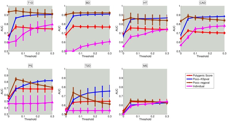
Fig 4. Comparison of the risk assessment performance of NetPocos, individual locus based features, and polygenic score on seven different diseases.
The x-axis shows the p-value threshold (α) used in filtering based feature selection and the y-axis shows the area under the ROC curve (AUC) for performance in risk assessment. The curve shows the average AUC score and error bars show the standard deviation of AUC score across 5 folds in 5 different runs.

