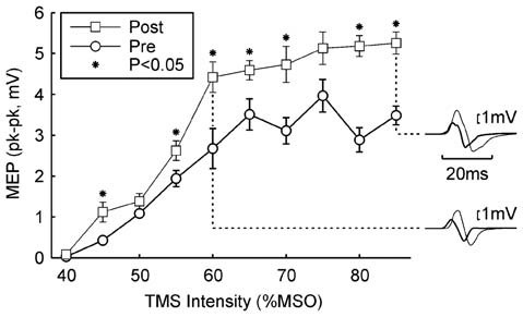
Figure 2.

Example result in one subject. The peak-to-peak height of the MEP is plotted against the TMS intensity (mean ± SEM). Circles show responses recorded in the morning, before wearable device use; squares show responses recorded in the afternoon, after 5.4 h of wearable device action. Asterisks denote responses which were significantly different between the two measurements (P < 0.05). Insets on the right illustrate averaged MEPs for intensities of 60% and 85% maximum stimulator output (MSO); thick traces are MEPs before wearable device use, thin lines after. Protocol Rest.
