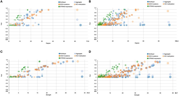
Figure 6.
Scatter plots of hub centrality. This figure shows the trend of the hub centrality against node degree and strength, before and after E2 stimulation. All scatter plots represent each single layer separately, the aggregate layer (the layer with all the nodes represented in the other layers) and the whole multi-layer model. In particular: (A) shows the scatter plot of hub centrality against node degree before the stimulation; (B) shows the scatter plot of hub centrality against node degree after the stimulation; (C) shows the scatter plot of hub centrality against node strength before the stimulation; (D) shows the scatter plot of hub centrality against node strength after the stimulation.

