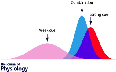
Figure 1. Cue conflict by combination of Gaussian activations .

The x‐axis refers to some quantifiable parameter distributed across a sensory network such as size, optical slant, spatial location, heading direction, etc., and the y‐axis reflects intensity of the sensory drive. The Gaussian curves depict the distribution of drive across the parameter space: the red curve denotes a strong (tall) and reliable (narrow) cue, and the pink curve a weaker and less reliable one. The blue curve reflects the outcome of a decision process that has taken both cues into account and derived a weighted average, in which the more reliable cue has exerted a stronger positioning effect.
