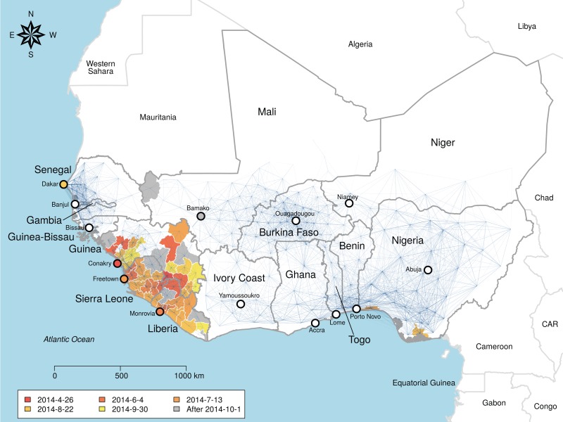
Figure 1.
Network of Ebola virus transmission probability in West Africa. Blue lines represent the transmission probability for the best-fit model, which includes effects of distance, population density and whether links cross the border surrounding Guinea, Liberia and Sierra Leone. Thickness is proportional to transmission probability, nodes are administrative unit centroids. The map is fully connected and invisible links represent orders of magnitude lower transmission probability. Administrative units used to fit the model are coloured by date of infection. Infections recorded after 1 October are coloured grey and were not included in the model fit.

