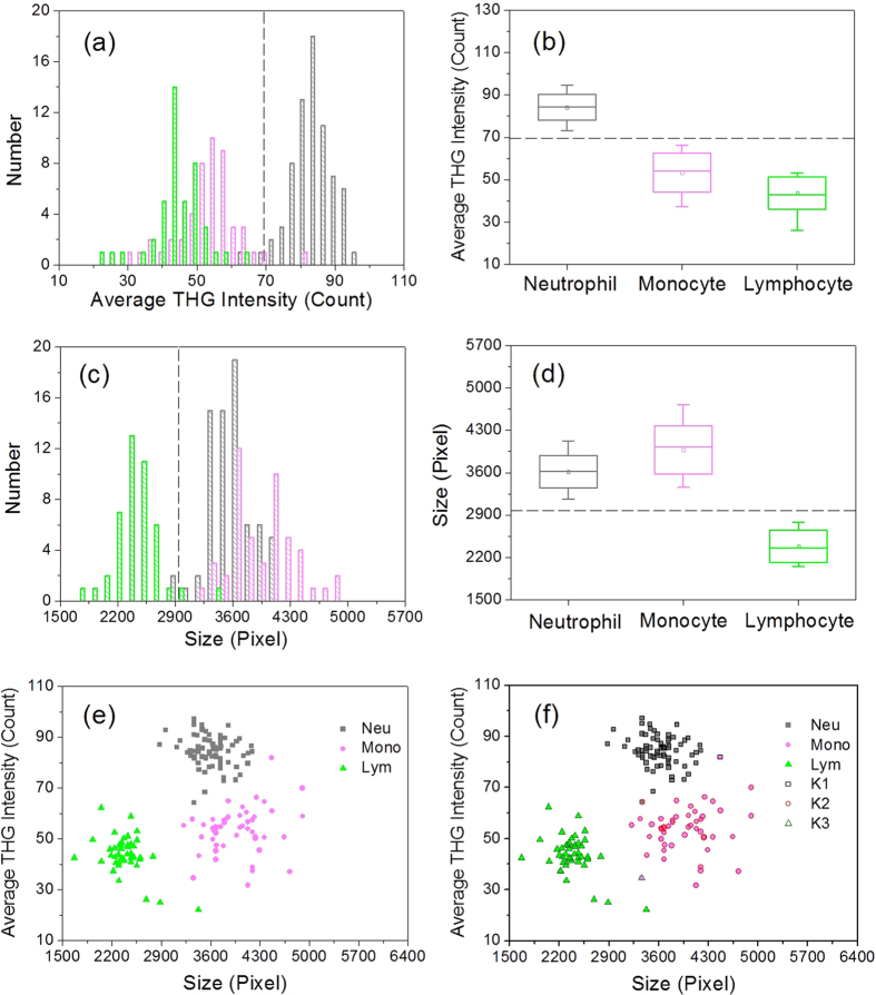
Figure 4.
(a,c) Histograms, (b,d) box charts, and (e,f) scatter plots of (a,b) the average THG intensity and (c,d) size of WBCs. The neutrophils (gray), monocytes (light magenta), and lymphocytes (green) were collected from the same tube of blood drawn from the same volunteer. In the box chart, the box range covers the mean ± standard deviation, and the whiskers cover 5% to 95% of the data. Three groups of data, K1 (black open square), K2 (open red circle), and K3 (open olive triangle), were clustered by the k-means clustering analysis. Neu: neutrophils; Mono: monocytes; Lym: lymphocytes.

