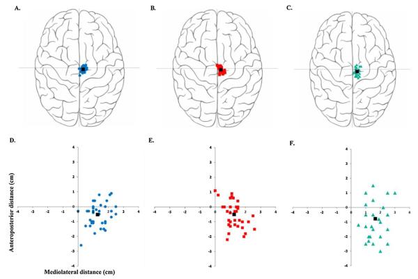
Fig. 2.
Hotspot loci in stroke and healthy participants. (For interpretation of the references to colour in this figure legend, the reader is referred to the web version of this article.)
The top panel (A–C) provides a visual depiction of the hotspot loci on a rendered brain image. The bottom panel (D–F) is an enlarged graphical representation of the anatomical measurements of the hotspots from the vertex (0, 0). Figure A represents the non-lesioned hemisphere (blue circles) of stroke patients. Figure B represents the lesioned hemisphere (red squares) of stroke patients. Figure C represents the non-dominant hemisphere (green triangles) of healthy participants. The black squares in each figure represent the mean loci of that hemisphere.

