
Figure 3.
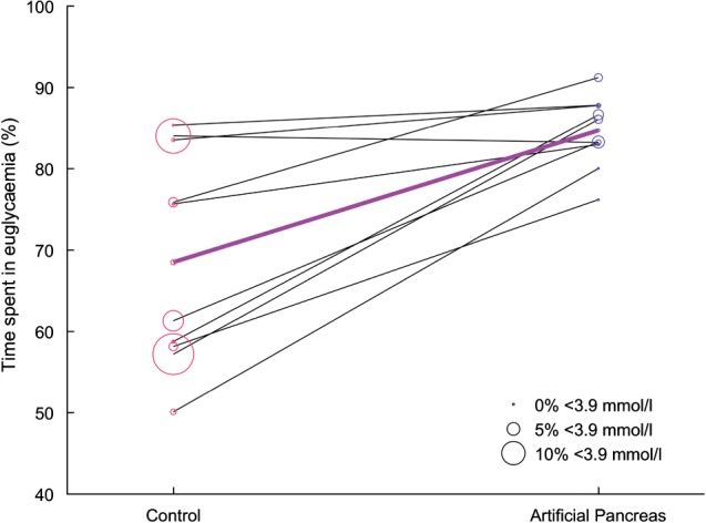
Percentage of time spent in euglycaemia per patient for both treatment periods. The bold purple line indicates the median time spent in euglycaemia. The size of each circle is proportional to the time spent in hypoglycaemia.
Official websites use .gov
A
.gov website belongs to an official
government organization in the United States.
Secure .gov websites use HTTPS
A lock (
) or https:// means you've safely
connected to the .gov website. Share sensitive
information only on official, secure websites.
Percentage of time spent in euglycaemia per patient for both treatment periods. The bold purple line indicates the median time spent in euglycaemia. The size of each circle is proportional to the time spent in hypoglycaemia.