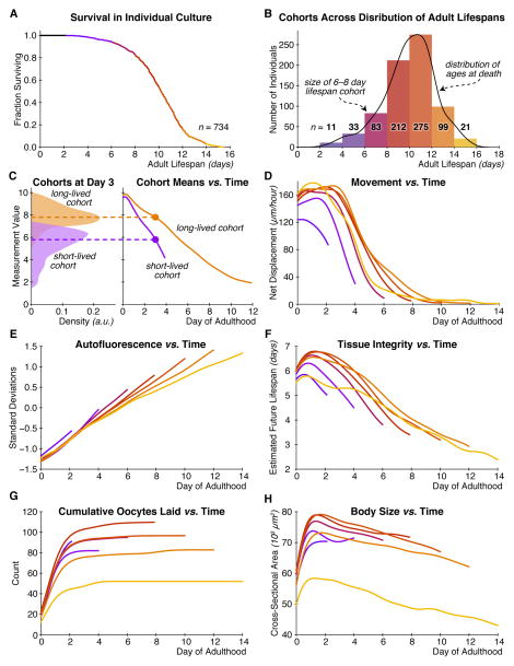
Figure 2. Variation in lifespan and physiology within a homogeneous population.
(A) The survival curve for all 734 individuals in our study population, as a function of age after reproductive maturity. (B) Histogram of the number of individuals in each of seven cohorts, grouped by lifespan into 2-day-wide bins. A kernel density estimate of the underlying distribution of ages at death is shown in black. (C) An illustration of how we calculate trends of a given measurement over time. At left, the distributions of values for some lifespan-predictive measurement are shown for a long- and short-lived cohort, at day three of adulthood. Dashed lines show the mean of each distribution. At right, the trend in these means over time is plotted for each cohort. (D) Trends of bulk movement between three-hour timepoints over time, for each lifespan cohort. Due to the limited size of the food pad, this measurement saturates around 160 μm/hour. (E) Trends in autofluorescence over time, measured as the 80th percentile of whole-body red-channel autofluorescence. (F) Trends in tissue integrity score over time. This score is produced via support vector regression that maps brightfield image texture into an estimate of remaining days of life. (G) Trends in cumulative oocytes laid. (H) Trends in body size.

