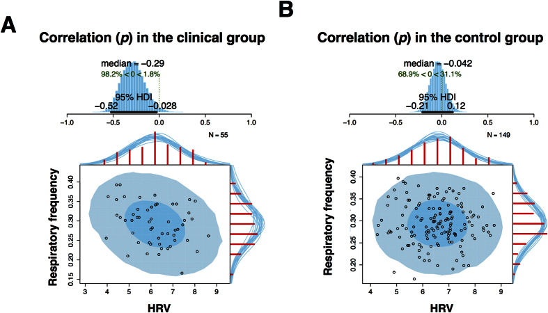
Figure 2. The relationship between respiration and HRV.
Plots demonstrate the relationship between respiration and HRV for the clinical (2A) and control group (2B). The blue histograms at the top of each figure show the posterior distribution for the correlation p with a 95% highest density interval (HDI). The scatterplots illustrate the relationships between these two variables, with superimposed posterior predictive distributions. The larger light blue ellipse shows the 95% highest density region while with smaller dark blue ellipse shows the 50% highest density region. The red histograms on the top x-axes and right y-axes show the marginal distributions of the data drawn from the posterior. HDI = Highest density interval.

