
Fig 3. Observed and fitted distribution of reported time to non-funeral exposure from symptom onset, hospitalisation, and death of the contact.
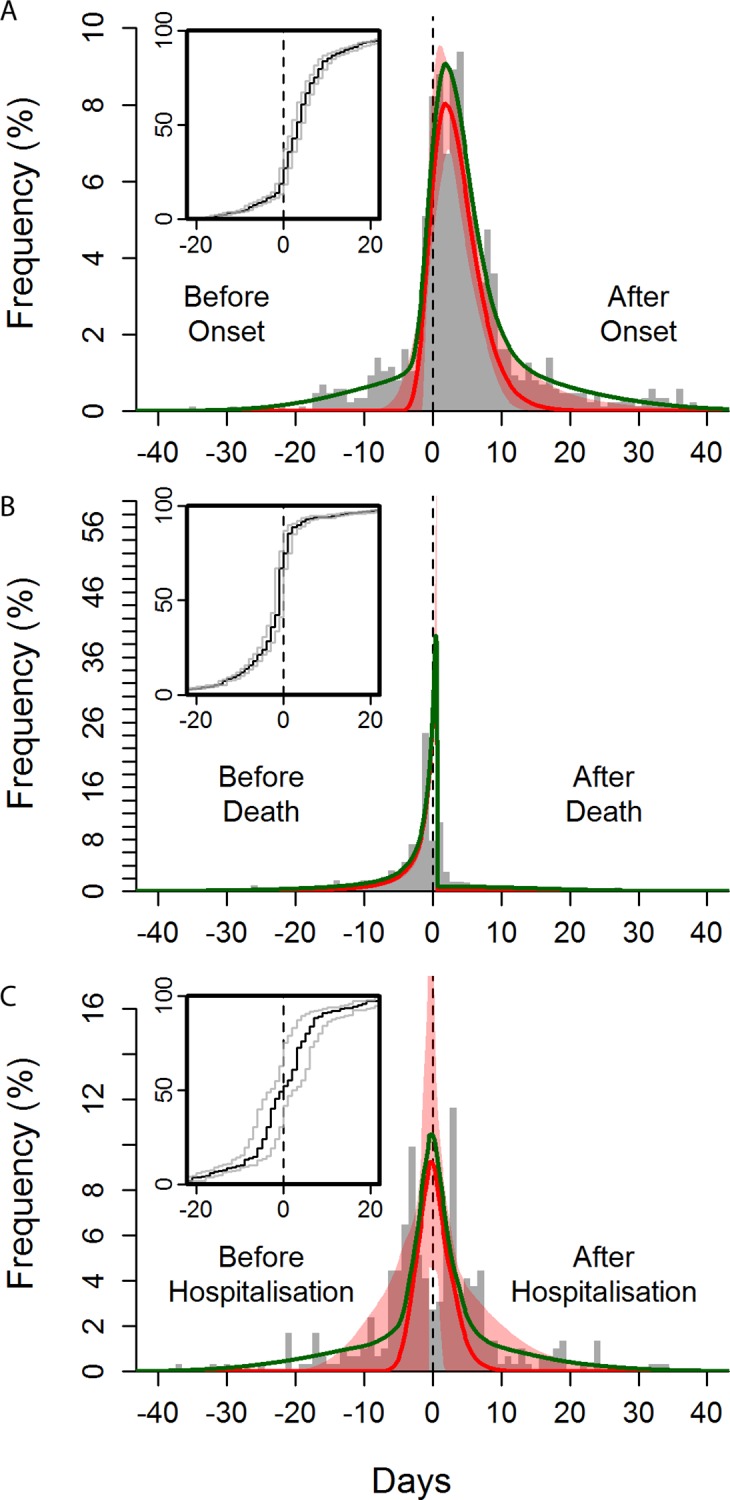
Time from symptom onset (A), death (B), and hospitalisation (C) of the contact to time of exposure. The green curves show the overall best fits, and the red curves show the best fits for the “signal” distribution (all obtained by maximum likelihood). The red-shaded areas indicate the 95% confidence intervals of the fitted “signal” distribution. The histogram shows a random set of exposure midpoints (in some instances, only a start or an end date of exposure is recorded; in those instances, the missing date is numerically imputed). Note that the fitting procedure is not performed on the midpoints but fully incorporates the exposure window (see section 1.8 in S1 Text). The inset panels are the observed cumulative distribution functions for the midpoint (black line) and start and end (grey lines) of the exposures.