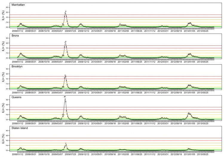
Fig 1. ILI+ for the five NYC boroughs.
Weekly ILI+ from the week ending 1/12/2008 to the week ending 9/21/2013 are shown by the ‘x’s; the black trajectory shows the 3-wk centered moving average. Color horizontal lines indicate different ILI+ levels (from the bottom to top: 0.1%, 0.25%, 0.5%, 1%, 2%, 3%, 4%, and 5%).

