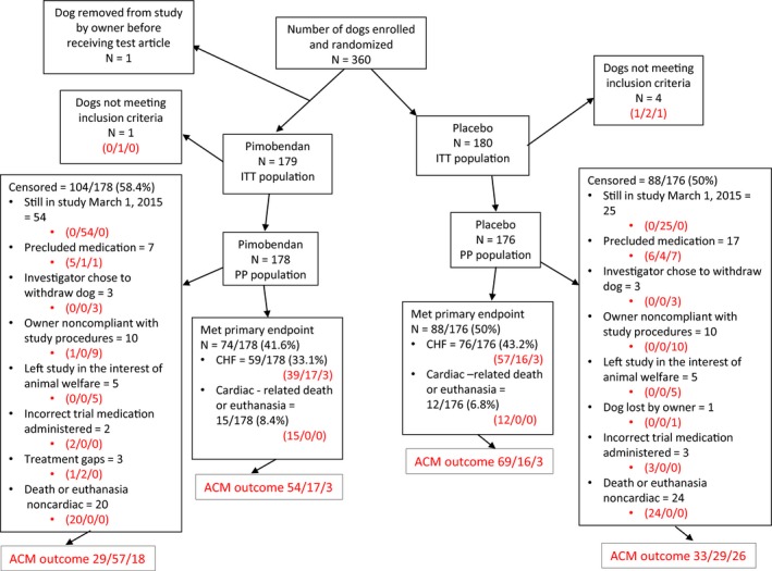
Figure 1.

A flow chart indicating the outcome of 360 dogs randomized in the study. Where 3 numbers appear in red in the diagram, they represent the outcome of dogs in each subgroup with respect to the all‐cause mortality analysis. They indicate, in the order in which they appear, dogs known to have died/dogs known to be alive/dogs lost to follow‐up. ACM, all‐cause mortality, ITT; intention to treat; PP, per protocol; CHF, congestive heart failure.
