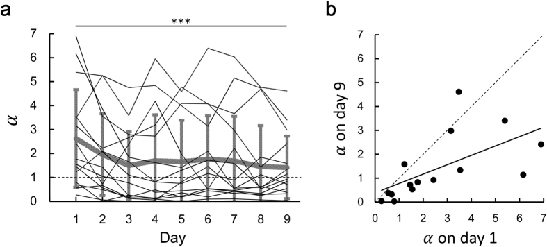
Figure 5. Estimation of the utility function.
(a) Time series of the estimated values of α. The thin black lines represent the value of α on a day for each participant. The thick grey line represents the average value across the participants and the error bars indicated the standard deviation. ***indicates p < 0.001 compared to day 9 (Dunnett’s post-hoc test following one-way repeated measures ANOVA). (b) The value of α on day 1 is plotted against that on day 9. Each circle represents each participant.

