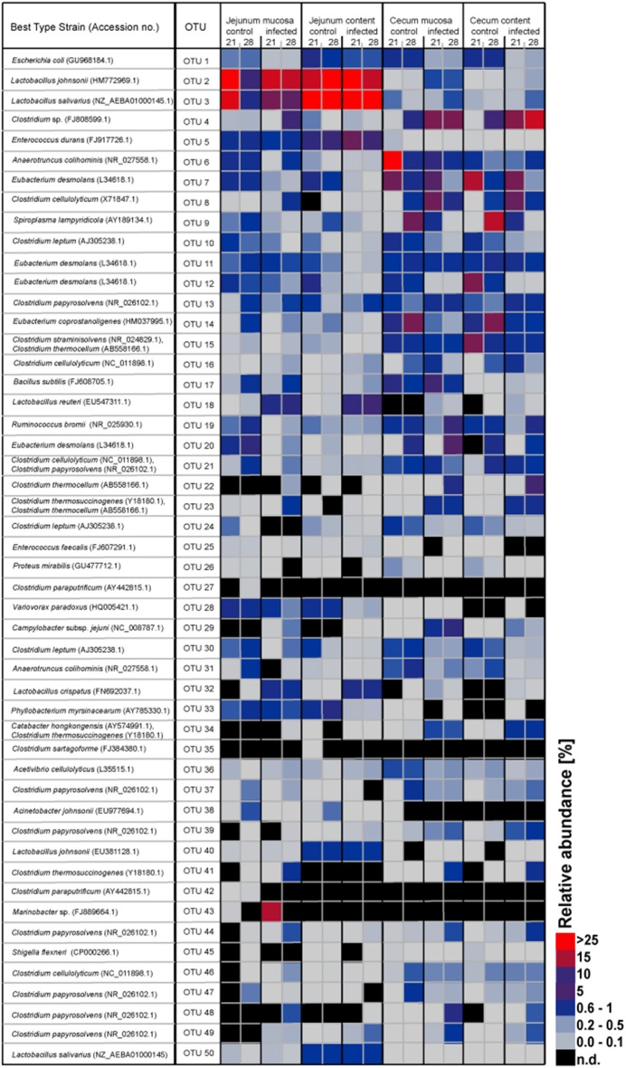
Figure 2.
Heatmap showing the relative abundances (%) of the 50 most-abundant OTUs sorted by gut sites of the infected birds compared with the controls at the two sampling points post infection. The heat map integrates relative abundance of a given phylotype. Colour scaling is ranged from 0 to ≥ 25%. n.d, not detected.

