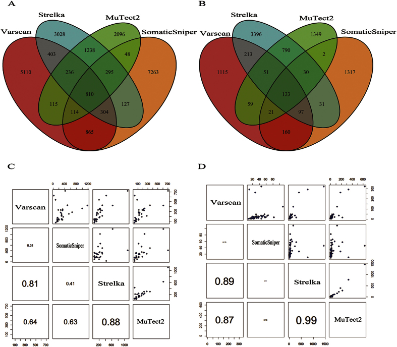
Figure 2. The relationship of mutations detected by four sSNV callers.
Venn diagrams of mutations based on WES (A) and UDT-Seq (B) data illustrate the overlaps between mutation candidate sets. Scatter-plot of mutation candidate sets from each sample based on WES (C) and UDT-Seq (D) data demonstrate the correlation between size of mutations detected by different callers: each dot in the upper panel represents the number of mutations detected from each tumor-normal tissue pair, and the lower panels display the Pearson correlation coefficients between the two callers with font size proportional to the correlations.

