
Figure 2. CSF sTREM2 levels in the different diagnostic groups.
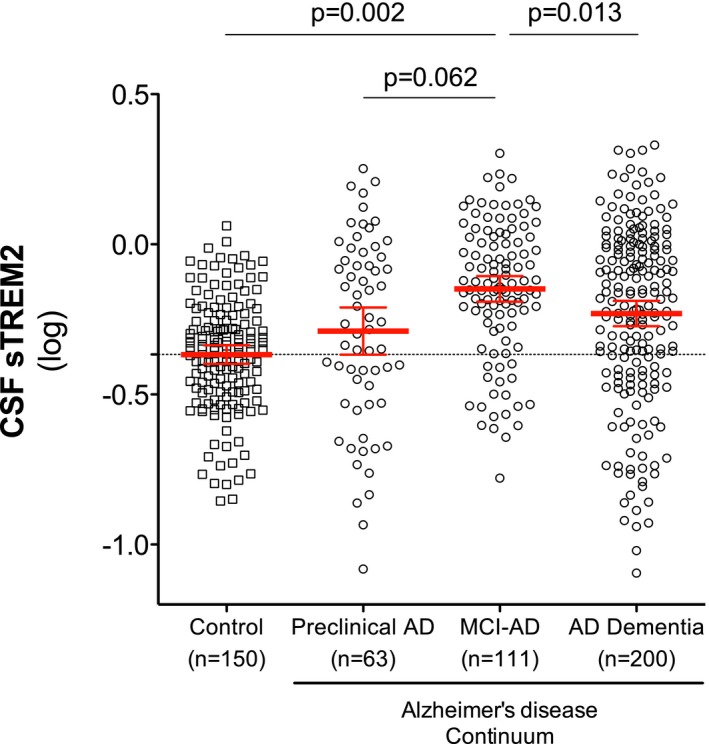
Scatter plot showing levels of CSF sTREM2 (log‐transformed) in the different diagnostic groups. Red bars represent the mean and the 95% CI. P‐values were assessed by a linear mixed model adjusted by age and gender (fixed effects) and center (random effects).