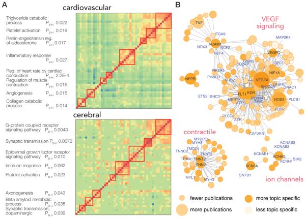
Figure 4.
Popular protein networks. (A) Pairwise normalized copublication distance matrices of top proteins in the cardiovascular and the cerebral system are shown. Cells in the heat map represent the normalized copublication distance between each protein–protein pair via their copublication history (red: greater number of copublications). Proteins may be clustered into identifiable pathways that are known to play significant roles in the physiology of each system, as shown on the left, suggesting the described method of using literature records to identify essential protein readily recapitulates known biology (PB–H: Benjamini–Hochberg adjusted P value of enrichment). (B) Proximal proteins of ten of the top proteins in the cardiovascular system are visualized in protein–protein interaction network graphs. The color of each node denotes the normalized copublication distance of a protein to cardiovascular research, where darker colors denote a protein is more preferentially found in cardiovascular publications compared with other fields. The size of nodes denotes publication counts in cardiovascular-relevant publications; size increases with increasing publication count. Selected hub genes and highly published cardiovascular proteins are labeled in black; in addition, proteins in the network with fewer than 10 publications are labeled in blue and represent proteins that are associated with popular proteins via protein–protein interactions but are themselves yet to be heavily investigated.

