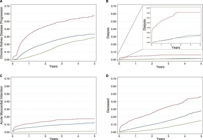
Figure 2.

Kaplan–Meier time to event plots for study end points. Kaplan–Meier curves are plotted from the time of percutaneous coronary intervention (or the beginning of the study period for controls) to each study end point event and stratified by 3 groups: percutaneous coronary intervention complicated by cardiac catheterization–associated acute kidney injury (red), uncomplicated percutaneous coronary intervention (ie, without cardiac catheterization–associated acute kidney injury; blue), and matched controls (green). Plot A depicts the proportion of patients progressing to either new chronic kidney disease or a higher chronic kidney disease stage. Plot B depicts the proportion of patients undergoing a dialysis procedure with the internal plot y‐axis rescaled to 0 to 0.07. Plot C depicts the proportion of patients developing a recurrent postprocedural acute myocardial infarction. Plot D depicts the proportion of all‐cause patient deaths.
