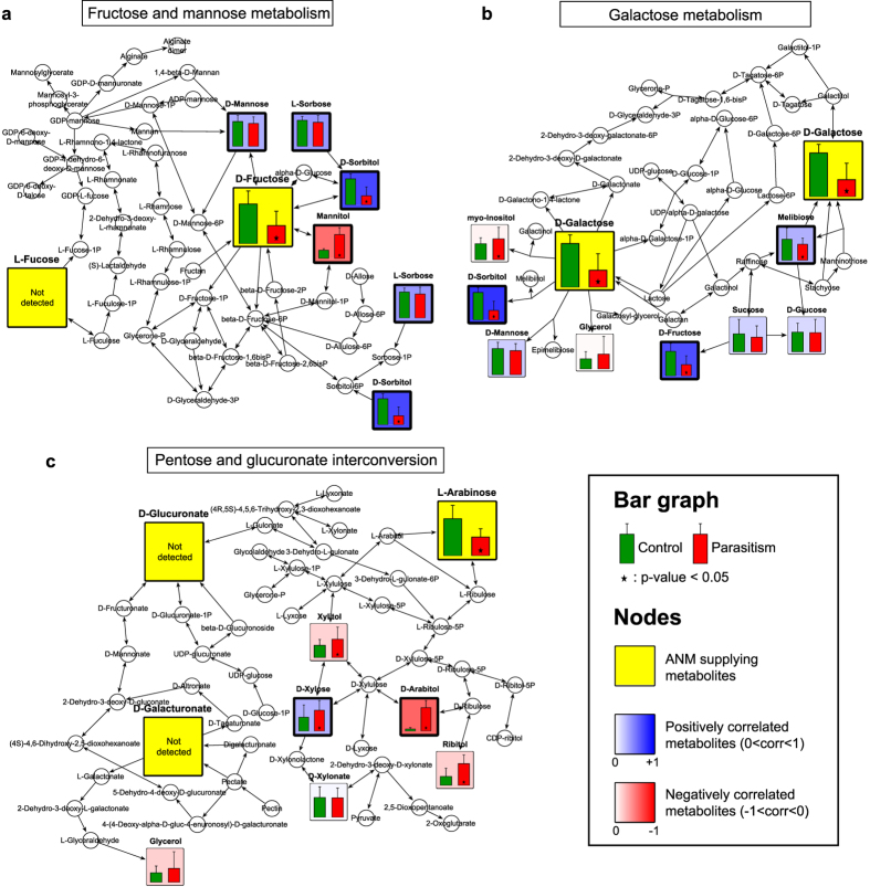
Figure 2. Pathway mapping reveals correlations between ANM supply metabolites and other metabolites.
Mapping of metabolic alterations for FMM (a), GM (b) and PGI (c). Metabolites (p-value < 0.05, marked with an asterisk) between control (green) and parasitized (red) leaves are colored based on their PPMCC values, ranging from −1 (negative correlation, red) to +1 (positive correlation, blue), against ANM supply metabolites (yellow). Values shown are the mean + S.D., with 30 replicates for each group.

