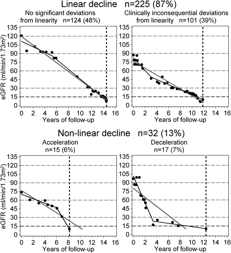
Figure 2.
Examples and frequency of linear and nonlinear of trajectories of eGFR decline classified with the linear spline approach. Trajectories were classified by comparing the linear model (solid gray line) with spline regression (solid black line). The dots represent eGFR observations, the horizontal gridlines correspond to boundaries of CKD stages, and the vertical dashed line indicates the onset of ESRD.

