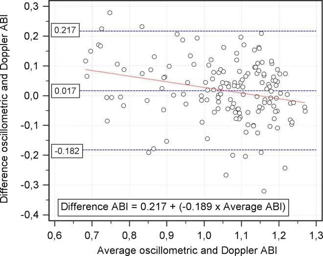
Fig 2. Bland and Altman plot of the oscillometric and Doppler ABI.
The differences between both methods, oscillometric and Doppler, are plotted as a function of the average of the two methods (n = 151). The blue dashed lines show the mean difference with 95% CI. Red dashed line shows the linear regression.

