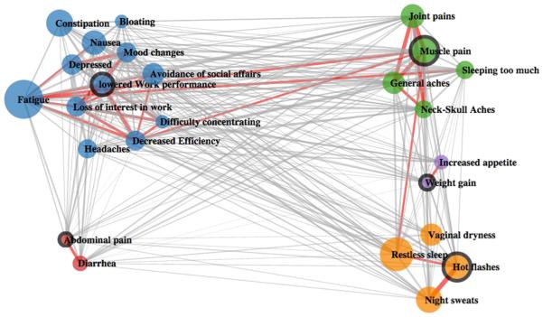
Fig. 3.
Clustering results for research study group T2 (severe symptoms only). The size of the circle reflects the frequency of the symptom. The thickness of the lines connecting individual symptoms reflects the degree of similarity between the two. The medoid of each cluster is highlighted using a thicker edge. Red linkages represent the highest 10 % similarity between nodes

