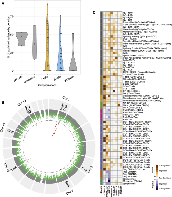
Figure 4.
The Genetics of Cell Counts and Immunoglobulin Level Variation in a General Population
(A) Violin plot representing the distribution of the percentage of variance explained by genetics for the immune traits. A total of 29 T cell subsets versus 27 B cell subsets were analyzed (mean percentages of variance explained by genetics of 29.5 versus 17.7, respectively; Student’s t test, p ≤ 0.05).
(B) Combined Manhattan plot of all cell types. Red dots mark genome-wide significant associations (p ≤ 5e−10). Immune cell types with the strongest association are indicated.
(C) Overview of the association of multiple genomic loci (ccQLTs) and immune cell types. Darkest colors indicate genome-wide significant ccQTLs, while divergence represents the direction of ccQLT effect.

