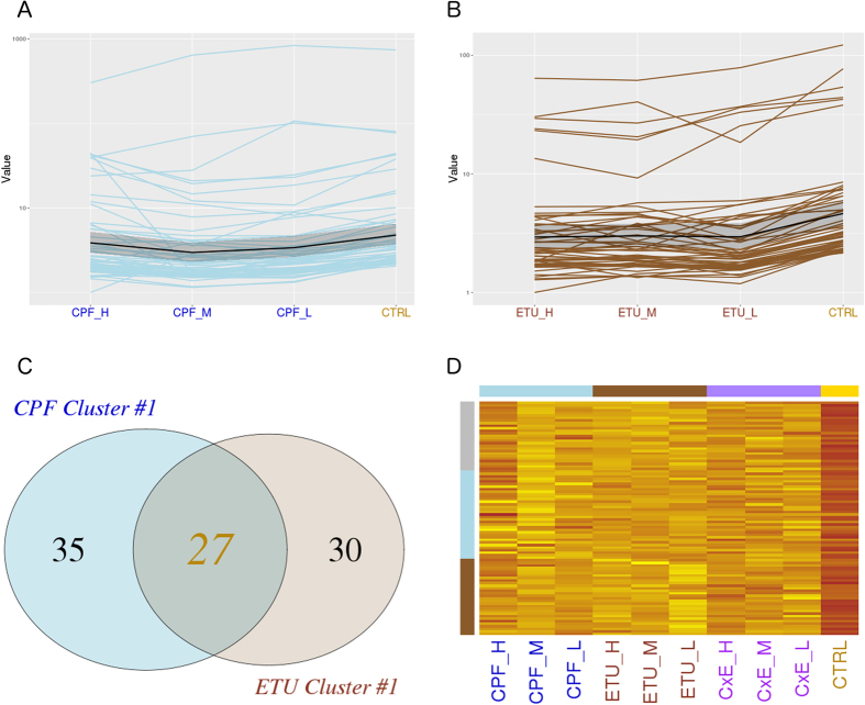
Figure 2. CPF and ETU clusters #1 expression profiling.
DEGs were partitioned by k-means clustering analysis. The expression profiles of genes included in the most significant cluster is reported as line plot across the different doses for CPF (A), for ETU (B) and, finally, compared by Venn diagram (C). The expression profiles of selected common genes are represented by heatmap for CPF and ETU, including the different doses and combination treatments (D).

