
Fig. 1.
Map of the spatial distribution of the migration locations in South Africa (orange dots).
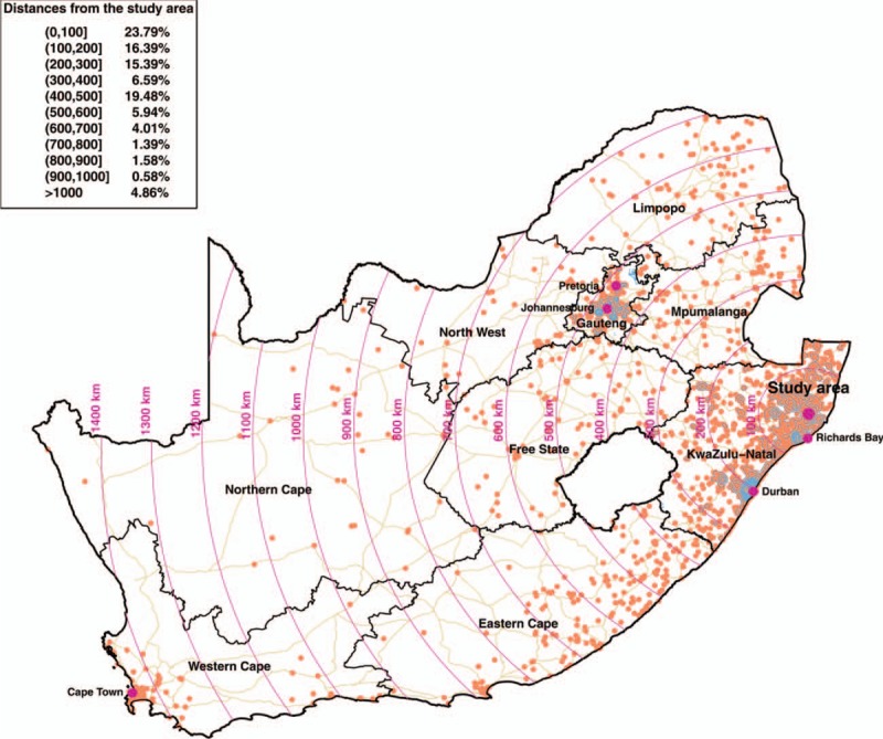
The location of the Africa Health Research Institute rural study community is represented by a larger violet dot, whereas cities that are key migration destinations are represented by smaller violet dots. We mapped the motorways, trunk, and primary roads in South Africa, together with the boundaries of the nine South African provinces.