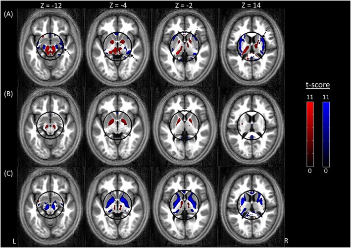
Figure 3.

Regions showing either higher (red) or lower (blue) GM probability when using the synthetic quantitative MT map as input to the segmentation algorithm as compared with A, a T 1‐weighted image, B, a quantitative R 1 map, and C, a quantitative MT map. For display purposes only, the results are presented at a statistical threshold of p < 0.001 without correcting for multiple comparisons and are overlaid on the average normalized MT map of the cohort. Note that the statistical analysis was restricted to a sphere, with a radius of 4 cm, in the centre of the brain. The outline of the sphere is indicated in black. The dashed arrows in A indicate WM regions in which the GM probability was lower for the synthetic MT map
